Design concept · Customer portal
TPG customer portal
A customer portal that answers before you have to call.
The project
What needed solving, and what we built.
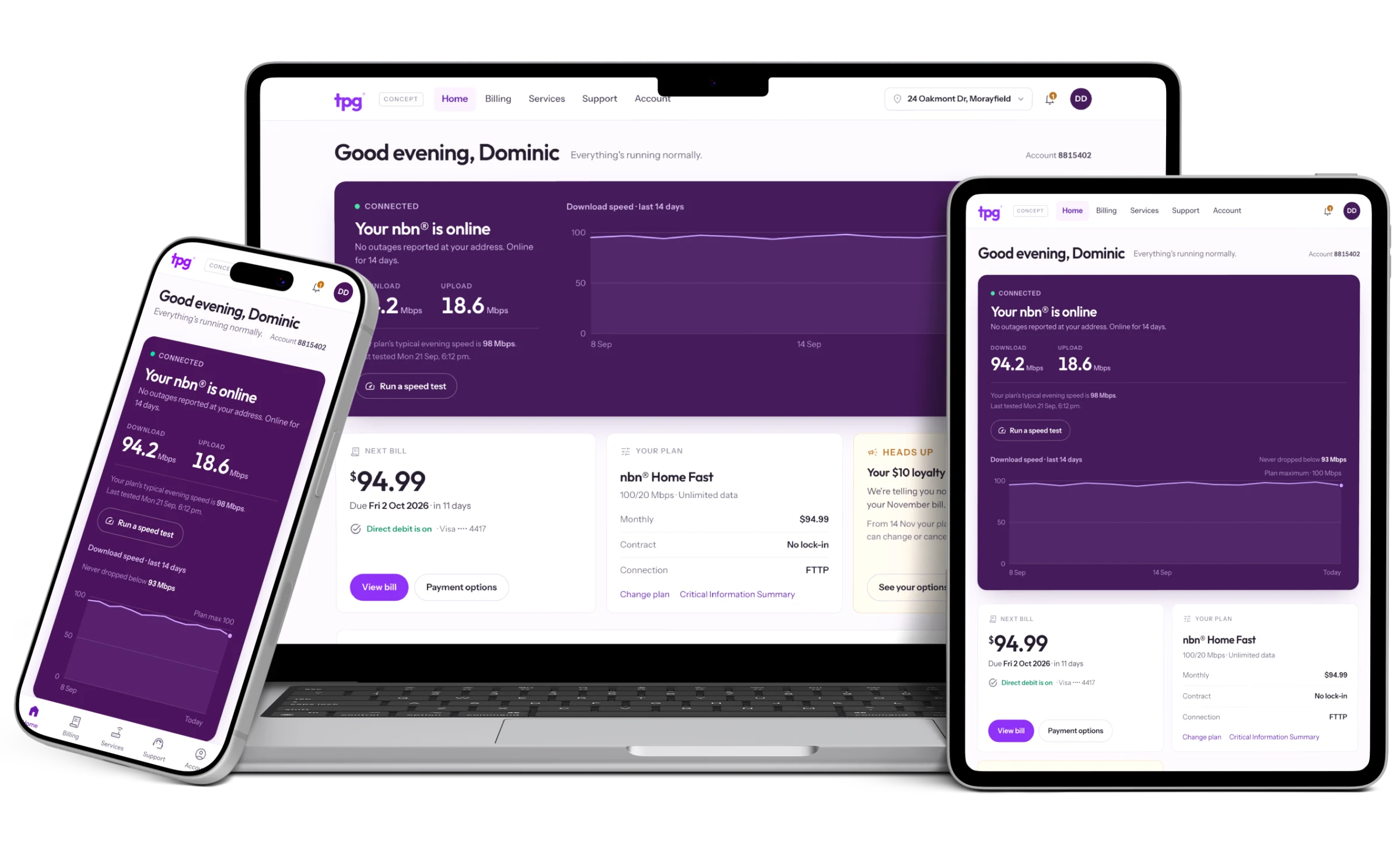
Dominic, our founder, was a TPG customer for a year and used the portal every month. It is fourteen text links in a column. It says ADSL over an nbn service, the contact form has a Fax field, and the two actions that matter most, changing plan and moving home, end in an error with a phone number in it. We despise bad software, so we rebuilt it.
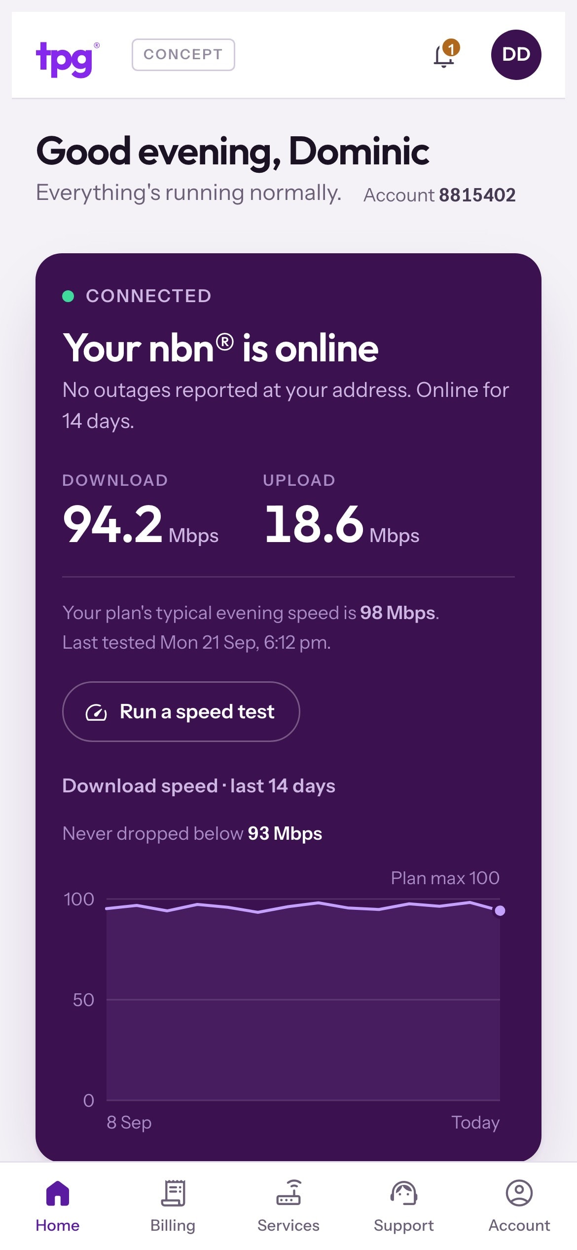
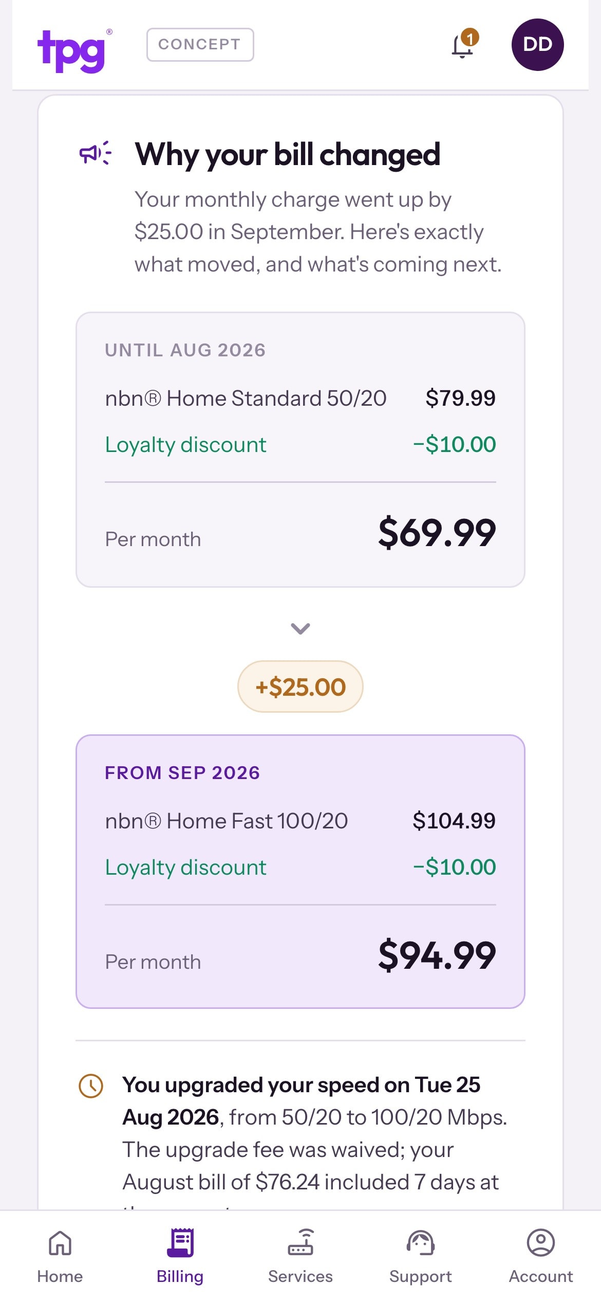
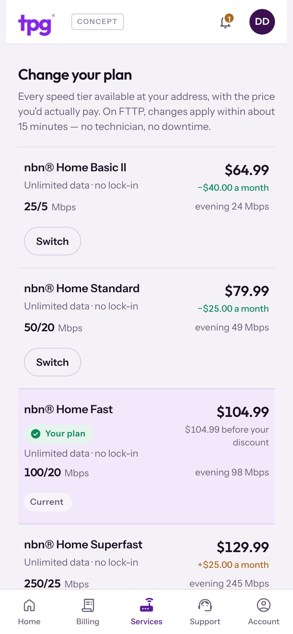
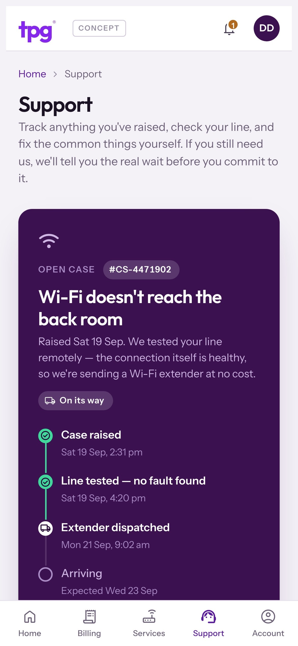
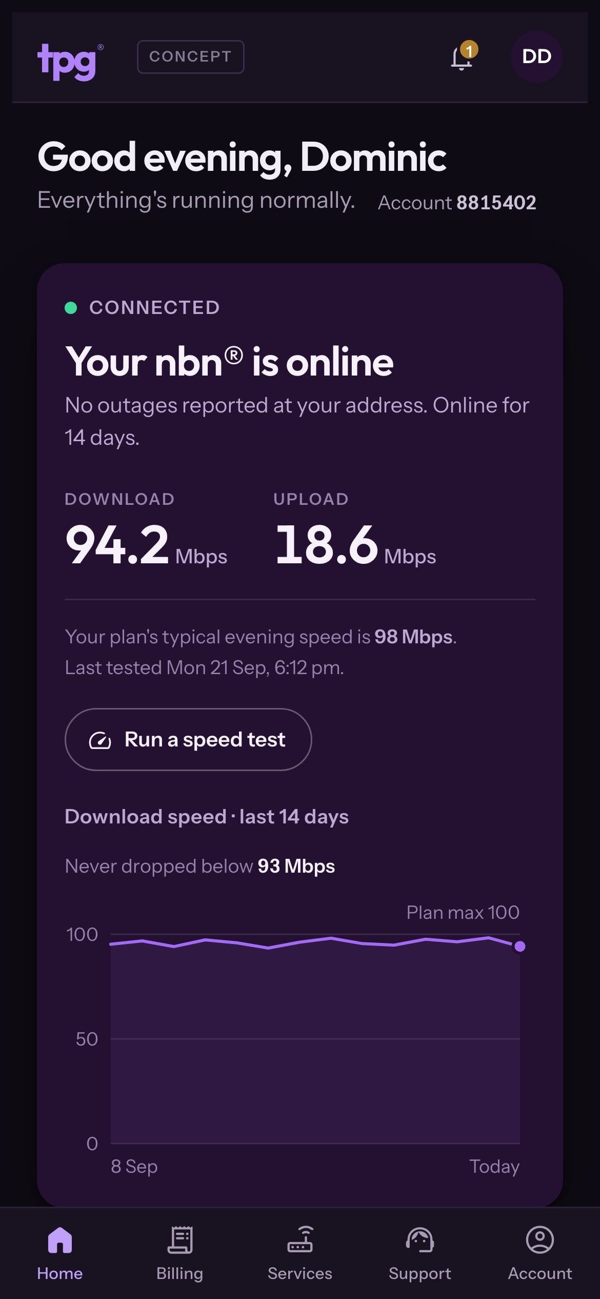
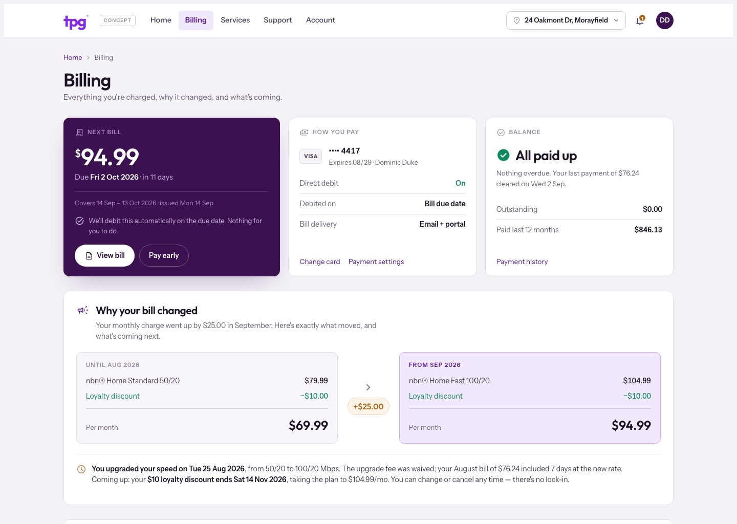
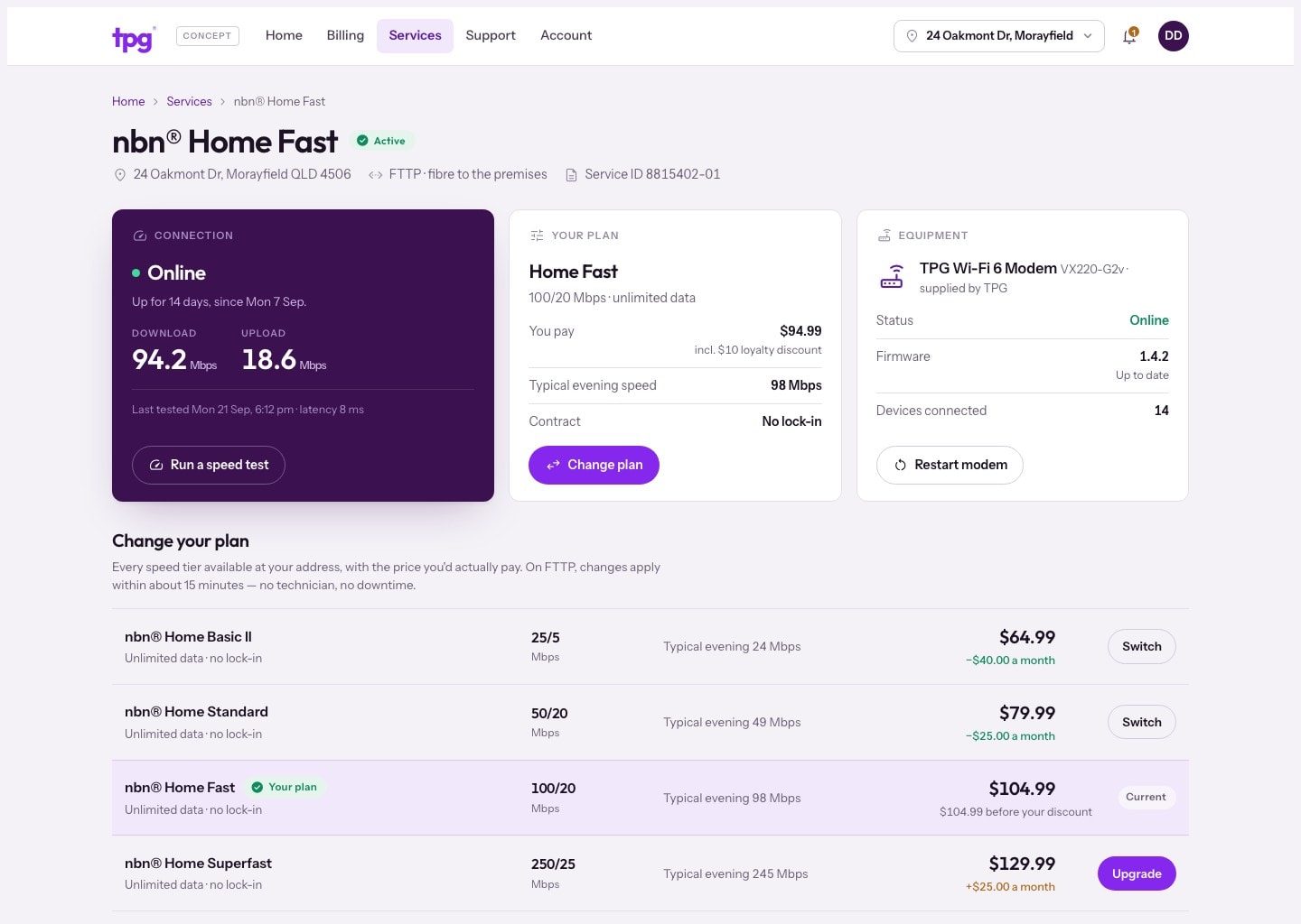
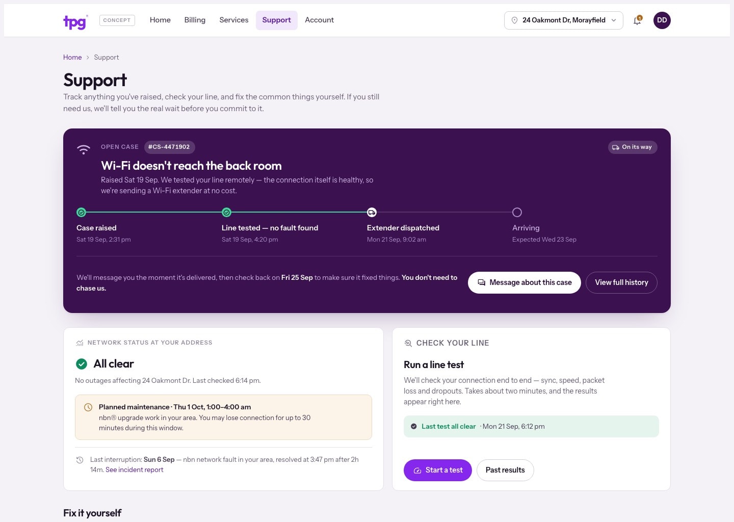
The concept answers the four questions every customer has before they go looking: is my service up, what do I owe and when, what am I paying for, and does anything need me. Billing explains why a bill changed before anyone has to ask, every plan change shows the real price difference, and support tracks a fault and runs a line test in the portal instead of handing out a phone number.
This is an unofficial design concept, not client work. It is not affiliated with or endorsed by TPG Telecom, and every name, figure and account detail on the screens is fictional sample data.
Read the full teardownThe process
How the project actually ran.
- [01]
Audit the live portal
Dominic logged back into his old TPG account on 21 September 2026 and captured every screen: fourteen links in a column, ADSL headings over an nbn service, a Fax field on the contact form, and a change-plan action that ends in an error with a phone number in it. Nothing staged, personal details blacked out.
- [02]
Decide what the page is for
One test for the home screen: within three seconds and zero clicks you know your service is up, what the next bill is and when, and whether anything needs you. Four rules followed from it, including never showing a system state without a human explanation and a next action.
- [03]
Redraw the structure
Fourteen system-grouped links became five sections a customer would actually look under: Home, Billing, Services, Support and Account. Dead ends were deleted rather than redesigned.
- [04]
Design in code
Five pages built as a working front end on sample data, in TPG’s real purple sampled from the screenshots, with a dark palette designed rather than inverted. Eighteen screens and components, every one marked as a concept.
The product
How it looks.
More work
Product design · Web · iOS · Android
Towntime Everything on in Hobart, one search away.
Rapid Reports · Purpose-built reporting software
Lambert School School reports without the Word templates.
Website · Design and build
Domain Tennis Book a court, join the club, find a coach.
Control Shift product · Early access
Engine 64 An AI agent that answers from your own content.
Want a customer portal your customers can actually use?
Tell us what you're working on and who it's for, and you'll get a straight recommendation. Free, no obligation.
Start your project