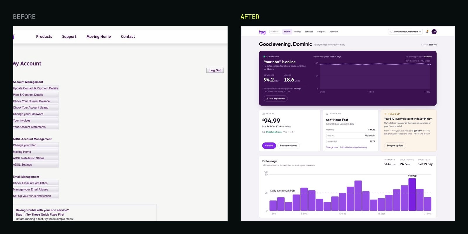
I was a TPG customer until earlier this year. Paid them every month, used the portal when I had to, cancelled, moved on.
Then the other day I remembered my login probably still worked. It did. So I started clicking, and writing things down.
Let me be straight up front, because it matters for everything below. My account is closed. I am not going to stand here pointing at empty fields and calling them broken, because empty is exactly what a cancelled account should look like.
What I am pointing at is the interface. The thing I was actually using, every month, while I was paying, and as far as I can tell the same one that is there today. You could stand it beside a Yahoo homepage from 2003 and struggle to pick which one was still in service.
Fourteen links in a column
This is the whole product. Fourteen text links in a column about 190 pixels wide. No name, no greeting, no plan, no balance, no due date, no service status. On my 1512-pixel screen, roughly 87% of it was empty. The loudest thing on it is Log Out.
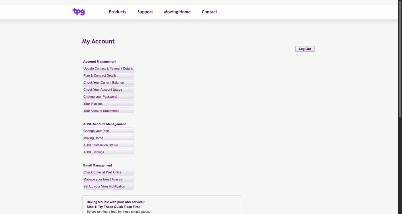
That is the same front door I remember using while I was paying for the service.
The second heading says "ADSL Account Management". My service was nbn. It said ADSL the entire time I was there.
Then the details that have nothing to do with my account at all. The contact form has a Fax field. The settings page advertises a Usenet server, news.tpg.com.au, in 2026. There are fields for five subnet addresses and five netmasks on a residential connection. The usage page counts how many hours you have left, a number that stopped meaning anything when dial-up died.
Every page I opened shares one HTML title: "ADSL Internet Broadband ISP - ADSL2 ADSL2+ Naked DSL Mobile VoIP". The same words in every browser tab, every bookmark and every history entry.
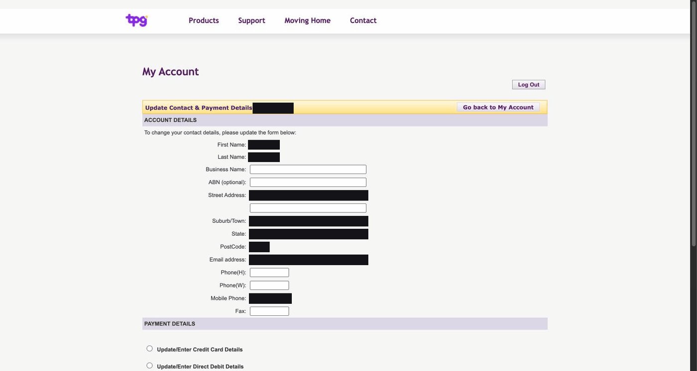
Your name, your address and your card details all live in that one form, behind one button. Your first and last name are printed as read-only text, so you cannot correct a misspelling of your own name.
The bill that went up while I was paying
In March my invoice went from $64.99 to $94.99, a thirty dollar jump in a single month while I was an active customer.
TPG may well have explained that somewhere. I am not claiming they didn't, and I have not gone digging through old email to find out. My point is narrower: the page where I would look is this one, and it says nothing.
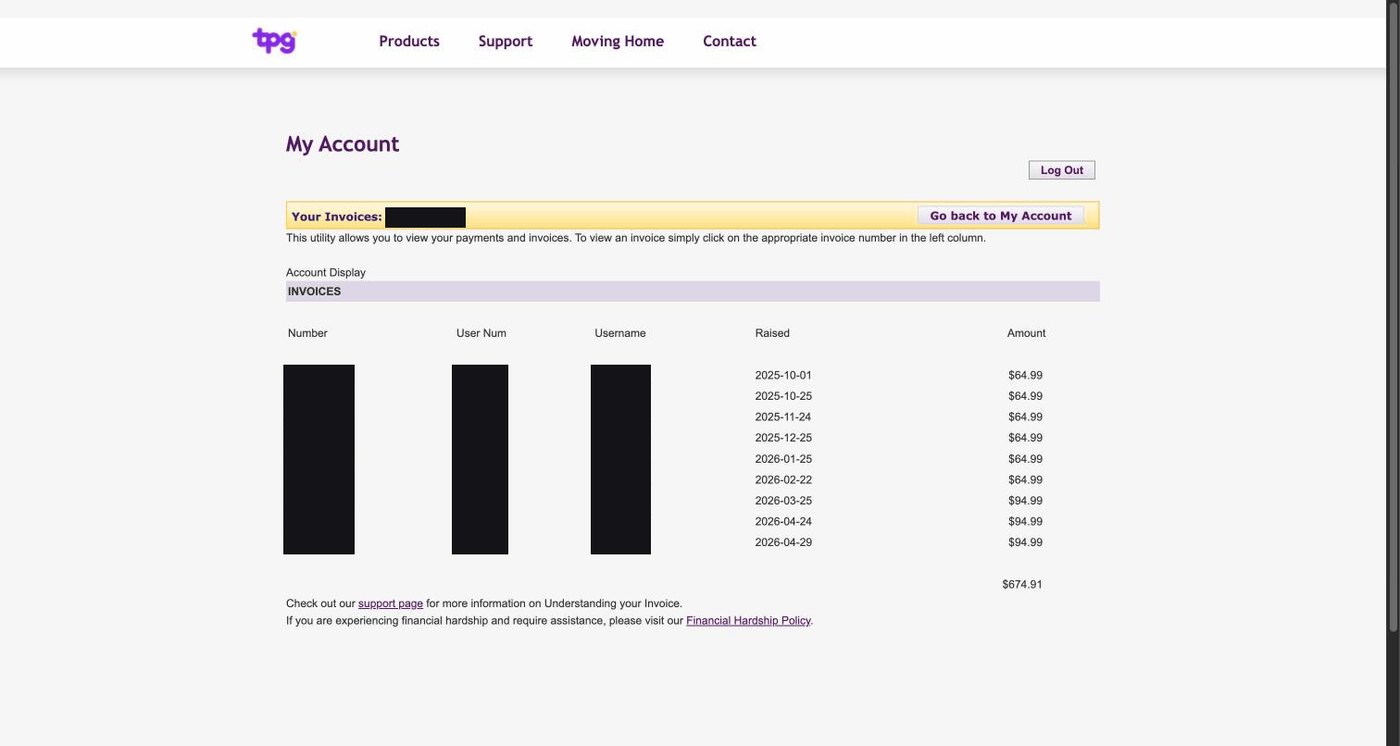
That is the invoices page. Five columns, three of them internal identifiers. No payment status, so nothing says paid, due or overdue. No sorting or filtering. An unlabelled total sits at the bottom right and you are left to work out whether that is what you have paid or what you owe. The amount changes by thirty dollars between two rows and nothing on the screen marks it, let alone explains it.
A bill going up is normal. Finding out by reading down a column of numbers is a choice somebody made.
What it does when it has nothing to say
Here is where I have to be careful, and I would rather say it than have you catch me at it.
Several pages came back empty or errored for me. Account Statements rendered its field labels with nothing beside them. Change your Plan and Moving Home both returned an error. I cannot tell you whether those work for a current customer, because I am not one.
But whether the feature works and what the screen says when it has nothing for you are two different questions. The second answer is bad regardless of whose account it is.
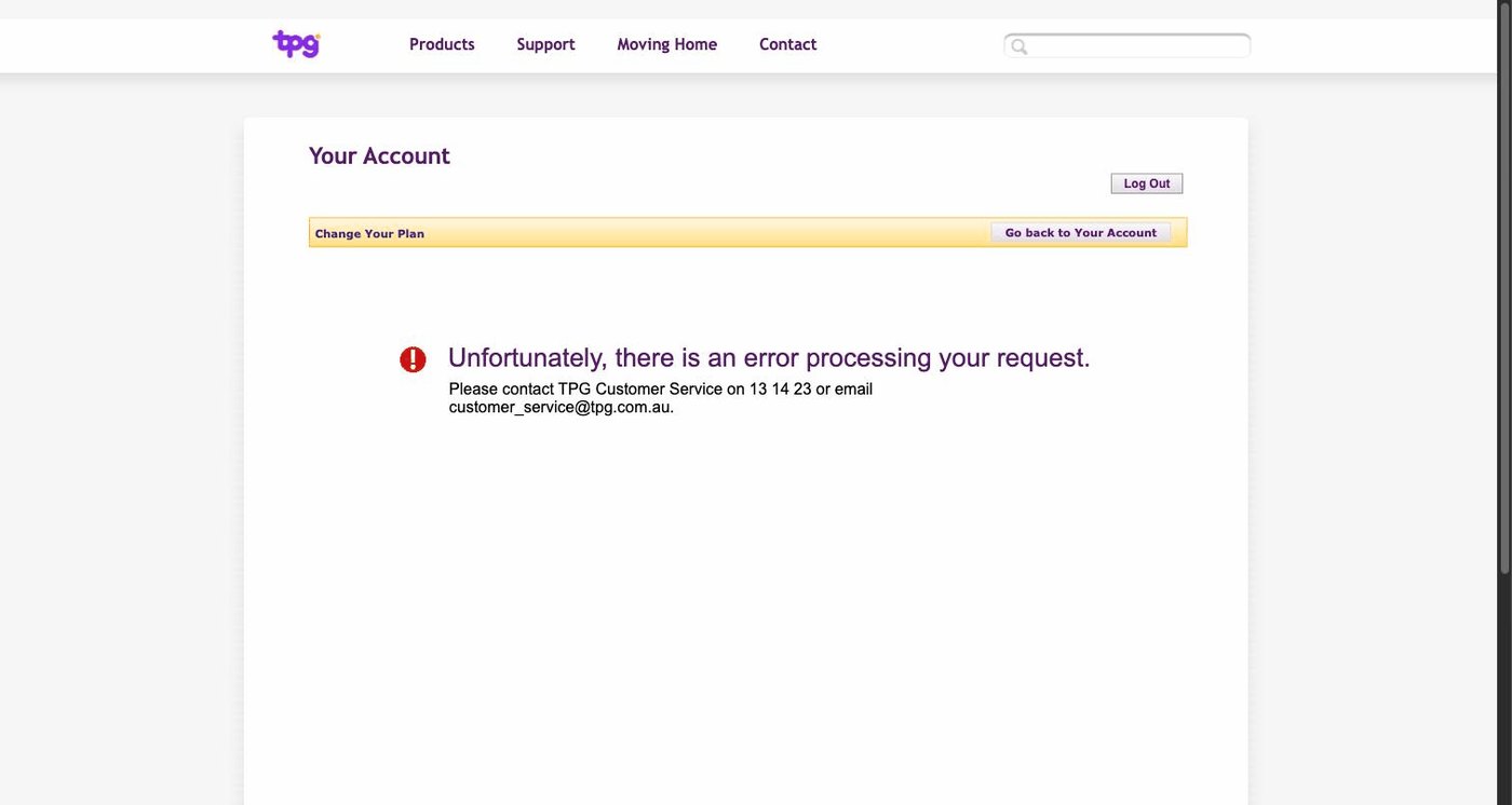
"Unfortunately, there is an error processing your request. Please contact TPG Customer Service on 13 14 23." That is the whole response. No reason, no code, no "your account is closed", no alternative. If my cancelled account is the cause, the screen is perfectly capable of saying so and doesn't.
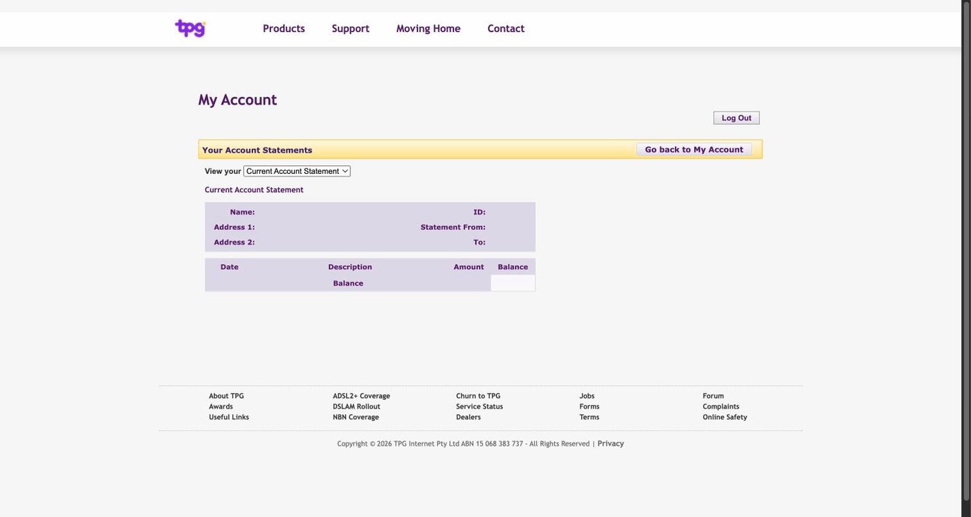
Same again. If there are no statements to show, say that. Rendering the words Name, Address and ID with a void beside each one is not an empty state, it is a page that has given up.
"Set Up your Virus Notification" is a top-level menu item that loaded a banner and then nothing. No controls, no content, no message about why it is blank.
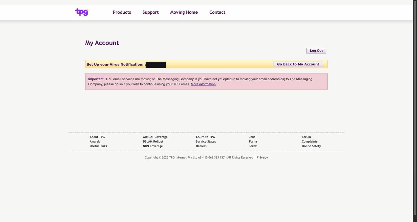
Two more while we are here. "Check Email at Post Office" hands you to a different company's branding, with different credentials and no way back. And the language throughout is a database talking to itself: expired, rejected, "Job card", and a link labelled "Check Your Current Balance" pointing at a URL containing function=trigger_payment.
It is not okay
Using software like this is a specific kind of misery. You go in with one question and come out with three. You click the reasonable thing and get an error with a phone number in it. Nothing confirms anything. Eventually you start wondering whether you are the one getting it wrong.
You are not.
And this isn't a startup that ran out of money, or a community site nobody has touched since 2011. TPG is one of the largest telcos in the country. That column of fourteen links is what they hand to paying customers, and it is what they handed me.
It looks like something barely touched for the best part of two decades while the company around it grew, and somewhere along the way that became acceptable to someone.
In the year 2026. It is NOT okay.
So I rebuilt it
Somewhere around the fourth dead page I stopped taking notes and opened a code editor. I despise bad software. I wasn't going to send TPG a list. I wanted to see what the thing should have been.
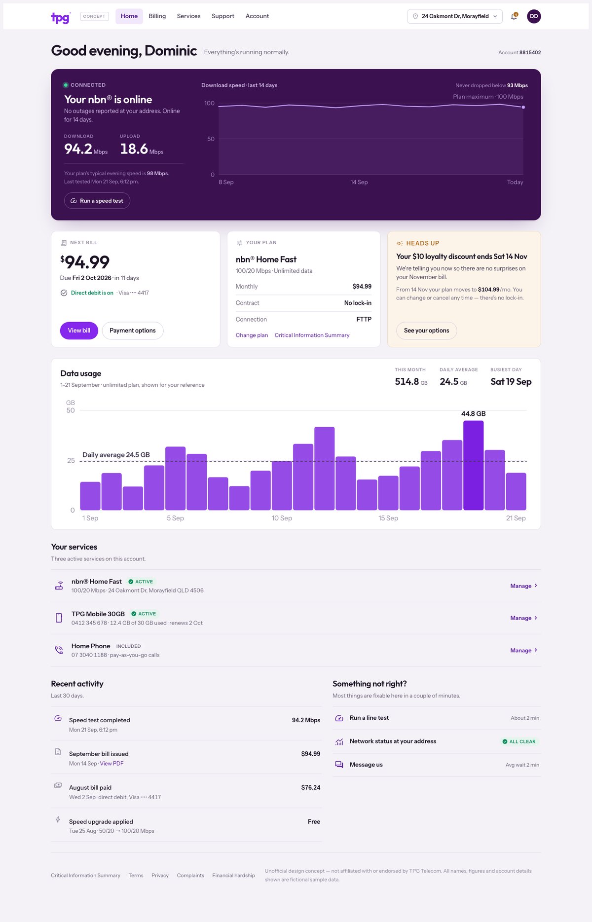
Five pages, one design system, TPG's real branding. I pulled their purple out of the screenshots rather than guessing. It's a working front end on sample data, not a mockup.
One test: you land, and within about three seconds and zero clicks you know your service is up, your next bill is a specific amount on a specific date, and whether anything needs you.
The bill that changes
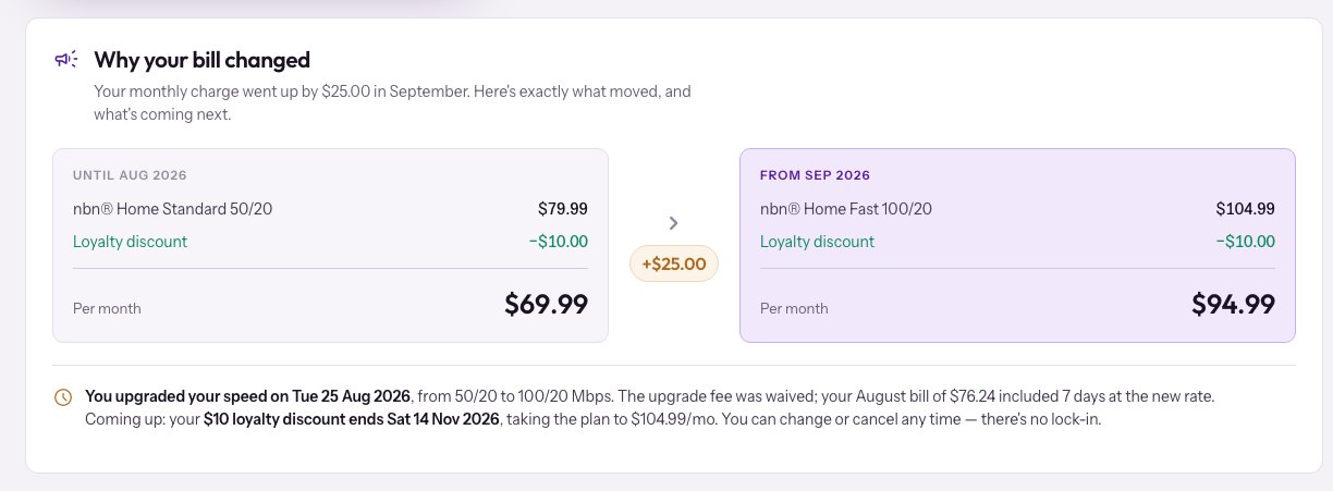
My thirty dollars, handled on the page where I would go looking for it. Two receipts side by side, the cause named, and the next change flagged two months before it lands instead of after.
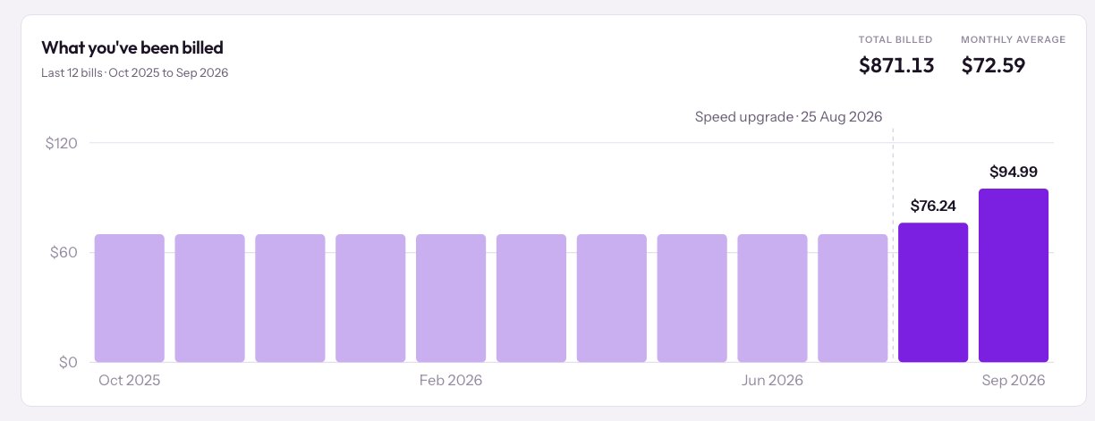
Then the same story as twelve months of billing. Ten flat months, then the two that moved. Those two are the only ones labelled.
Somewhere to actually do things
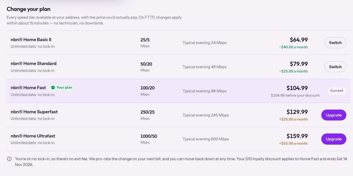
Change your Plan becomes the nbn speed ladder, inline. Every tier available at your address, the typical evening speed, the real price, and the difference in plain language. "$25.00 less a month". Not a form that errors.
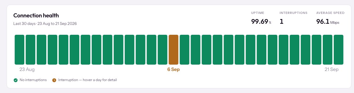
And instead of a page full of expired, thirty days of connection health with the one outage owned rather than hidden.
Support that doesn't end in a phone number
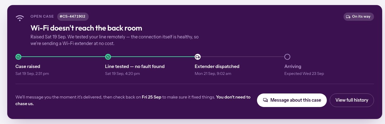
TPG's portal had no ticket history, no outage status for your address and no appointment tracking. Its line test sent results by SMS within 24 hours and kept no record you could see.
This one tracks the case, runs the test in the page, and publishes the real phone wait by hour so you can pick your moment instead of gambling.
Four rules
Answer the obvious questions above the fold. If someone has to click to find out whether their internet works, the page already failed.
Never show a system state without a human explanation and a next action. expired isn't a message. Neither is a blank space where a value should be.
Every menu item has to go somewhere that works. Delete a dead end rather than ship it.
Tell people before they have to ask. A price change especially, in the place they will go looking. That is the one that costs you the relationship.
What it costs them
Every gap in that portal pushes someone to the phone. A price change you have to work out from a column of numbers. An error with no reason on it. A page saying nothing at all where an answer should be.
The portal's real design pattern is contact TPG Customer Service on 13 14 23.
Call centres are the most expensive channel a telco owns. A portal that leaves a thirty dollar increase unexplained on the page you would check isn't a design problem with a cost attached. It is the cost. That's the number to measure a rebuild against, not how modern the buttons look.
And this isn't hard. There's no new technology in any of these screens. The invoice list needs a status column. The error page needs to say what went wrong. Mostly it's deciding that the customer's questions are the ones worth building around.
The full set
Eighteen screens and components. Every one is marked as a concept, and every figure is sample data.
What this is, and what it isn't
One person, one account, captured on 21 September 2026. The screenshots are real. Every one came out of my own logged-in session, and nothing in them is edited except black boxes over my address, customer ID and invoice numbers. Nothing staged, no cherry-picked bad day.
I have tried to be careful about the line between what I can show and what I am assuming. The design, the Fax field, the Usenet server, the ADSL headings and the price rise were all there while I was paying. The empty pages and the errors I have deliberately not called broken, because my account is closed and I cannot test them as a current customer.
So I don't know exactly what the portal looks like for you today. I suspect the front door is identical, because none of that depends on who is logged in. But I haven't seen anyone else's account and I'm not going to pretend otherwise. If yours looks different, I would genuinely like to know.
TPG does have a newer portal at myaccount.tpg.com.au. It never loaded for me. That may well be my account, so I am not counting it against them.
The rebuild is an unofficial concept. Not affiliated with TPG Telecom, not endorsed by them. Every screen is marked as a concept and every figure in it is made up.
I'm not a customer any more, so none of this costs me anything. I did it because the gap between what that portal is and what it could be is about a weekend of work, and somebody should say so.