Imagine you are filling out a form and the first field asks for your email address.
You type the first letter. Before you can type the second, the field turns red and a message appears underneath it:
Please enter a valid email address.
Of course it is not valid. You have not finished typing it yet.
The form is technically correct, but the experience is wrong. It has interrupted you to point out a problem that does not exist. Instead of helping, the interface feels impatient. You have barely started and it is already telling you that you have failed.
There is another version we have all experienced. You complete a long form, press submit and nothing seems to happen. Eventually you notice a message at the top saying there are errors below. You scroll back through every field trying to find the problem, hoping the form has not forgotten anything you entered.
These are opposite behaviours, but they come from the same design mistake. The software is responding at the wrong moment.
Thoughtful UI/UX is not only about how a product looks. It is about how the product behaves while someone is using it. Good design gives people the right information when it becomes useful, confirms progress without creating noise and helps them recover when something goes wrong.
Validation should respond to intent
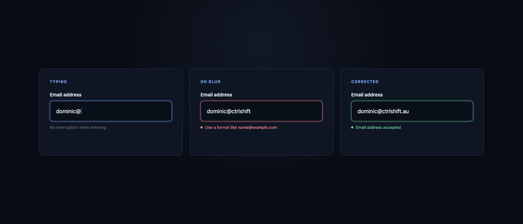
A form needs to validate its information. The question is not whether validation should happen. The question is when the user should hear about it.
Validating an email address on every keystroke ignores what the person is doing. While they are actively typing, an incomplete value is expected. Showing an error during that moment adds stress without helping them make a better decision.
A more considerate approach is often to validate when the person leaves the field. Developers call this the blur event. By moving to the next field, the user has signalled that they believe the email address is complete. If it is missing an @ symbol or has an obvious formatting problem, that is a useful moment to explain it.
Timing can become more responsive after an error has appeared. Once the user returns to correct the address, the form can check the value as they type and remove the message as soon as the problem is fixed. They receive immediate confirmation that the correction worked, without being criticised while entering the original value.
That gives us a simple pattern:
- Do not show an error while the user is entering a field for the first time.
- Validate when they leave a completed field, or when they try to continue.
- If an error is shown, update it promptly as they correct the value.
- Always validate again when the information reaches the server.
There are exceptions. A password strength indicator can be useful while someone types because the guidance helps them create a valid password. A character count matters when there is a meaningful limit. Search suggestions are useful because the person is expecting the results to change with their input.
The right behaviour depends on intent. Good UI/UX asks what the user is trying to do in that moment, then responds accordingly.
Error messages should help someone recover
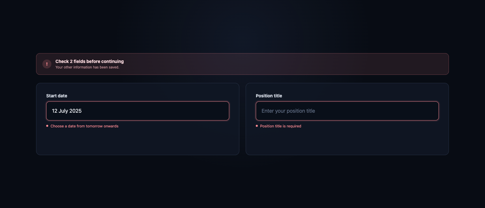
“Invalid input” tells a user very little. It identifies a problem without explaining how to solve it.
A useful message is specific and practical:
- “Enter an email address in the format name@example.com.”
- “Choose a date from tomorrow onwards.”
- “Your password needs at least 12 characters.”
- “We could not process the payment. Your card has not been charged.”
The wording matters, but placement matters too. The message should appear next to the field it describes. The field should have a clear visible label, and the error should not rely on the colour red alone. An icon, text and accessible connection between the field and message help people using screen readers or those who cannot easily distinguish colours.
If a user submits a form containing several errors, the product should take them to the first issue and provide a clear summary. Their information should still be there. Fixing one field should not reset another, close the form or send them back to the beginning.
This sounds obvious when written down. In real products, these details are often where frustration accumulates.
Show progress without turning the form into a light show
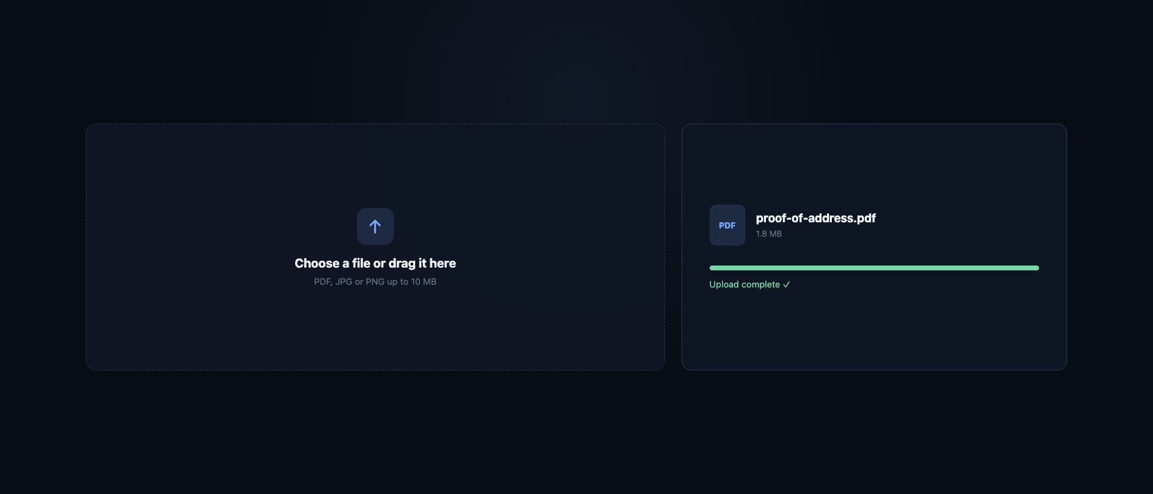
Good feedback is not limited to errors. People also need to know when things have worked.
A subtle confirmation beside a completed email address can reassure the user that it has been accepted. A step indicator can show where they are in a longer application. An upload should show whether a file is waiting, in progress, complete or unsuccessful. A save action should make it clear when changes are safe.
The key word is subtle. If every field flashes green, displays a tick and announces success, the interface becomes noisy. Confirmation is most useful when the user might reasonably be uncertain.
We can ask:
- Does the user know their action was received?
- Do they know what has been completed?
- Do they know what happens next?
- If something takes time, can they tell that the product is still working?
A button that changes from “Submit” to “Submitting” prevents uncertainty and discourages duplicate clicks. A clear completion screen confirms that the process is finished. An email receipt gives the user something they can return to later.
These moments create trust. The software feels calm because it keeps the person informed.
The right component makes the answer easier
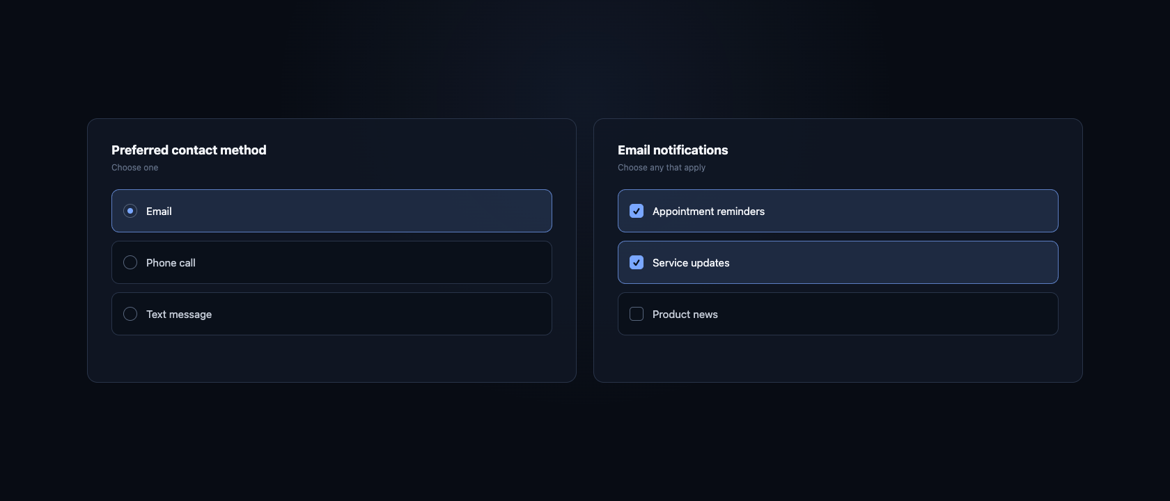
Interface components are not interchangeable decorations. Each one creates a different kind of decision.
If someone must choose one option from three, visible radio buttons may be clearer than a dropdown. If they can choose several options, checkboxes communicate that better than selectable cards with unclear behaviour. A date picker may help with an upcoming appointment, while direct text entry can be faster for a date of birth.
The right choice depends on the number of options, how familiar they are, whether comparison matters and which device the person is using.
Thoughtful form design also uses the capabilities already available on that device:
- An email field should open an email friendly keyboard on mobile.
- A phone field should make number entry easy without rejecting legitimate international formats.
- Password managers and browser autofill should be allowed to help.
- Labels should remain visible rather than disappearing when the user starts typing.
- Focus should move in a logical order for people using a keyboard.
- Buttons should be large enough to use comfortably on a touch screen.
None of these choices is especially dramatic. Together, they determine whether a form feels natural or strangely difficult.
Helpful APIs should reduce effort, not remove control
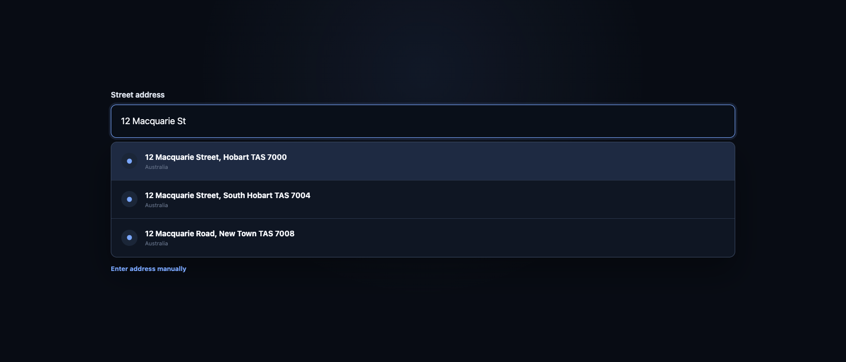
An address is a good example of where an external service can improve the experience.
Instead of asking someone to type a street address, suburb, state and postcode into separate fields, a service such as Google Places can suggest complete addresses as they type. This reduces effort, avoids common spelling errors and can provide cleaner information to the business.
But autocomplete should assist the user, not trap them.
Some addresses are new, unusual or absent from the provider. Rural properties, unit arrangements and international addresses do not always fit a neat suggestion. The person should be able to enter or correct their address manually. Suggestions should work with a keyboard, be announced accessibly and never erase information unexpectedly.
The same principle applies to postcode lookup, company search, identity verification and other connected services. An API can make a good experience faster, but it also introduces loading, failure and incomplete results. The interface needs a sensible response for each of those states.
“Use address autocomplete” is a feature request. “Help people enter an accurate address quickly, while always allowing manual correction” is a design requirement.
Good UX includes the moments when things go wrong
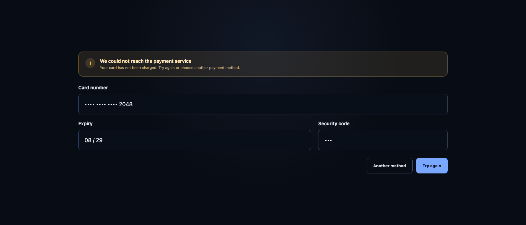
A form designed only for perfect conditions is unfinished.
Internet connections drop. Payment providers take longer than expected. A session expires. A requested username is already taken. A file is too large. An external address service becomes unavailable.
The product should not pretend these situations will never happen. It should handle them in a way that protects the user’s effort and explains the next step.
If submission fails, keep the information. If a process can safely be retried, say so. If the action may already have completed, do not encourage repeated attempts without checking. If the product needs several seconds, show progress rather than leaving a frozen button on the screen.
Error handling is part of the user experience because failure is part of using software. A clear recovery path can create more trust than a product that works perfectly in a demonstration but becomes confusing at the first unexpected event.
Easy to use is the result of many deliberate choices
When software feels intuitive, it can be tempting to assume the design was simple. Usually the opposite is true.
Someone considered when validation should appear. They chose the right control for each decision. They decided how success, loading and failure should look. They made room for accessibility, mobile devices, autofill and keyboard navigation. They worked out which external services could reduce effort and what should happen when those services were unavailable.
These decisions should not be left until the interface is being polished. They belong in requirements, prototypes, development and testing.
For an important form, we should be able to describe more than the fields it contains. We should understand:
- when each field is checked
- what makes the value valid
- which message appears when it is not
- how the user corrects it
- what completion looks like
- what happens if submission fails
- whether the form preserves the person’s work
- how the whole process works without a mouse
That is thoughtful UI/UX in practice. It is not decoration applied after the software works. It is part of what makes the software work well for a human being.
The best form rarely draws attention to these decisions. It simply feels clear. The user knows what to do, receives help at the right time and reaches the end without having to think about the interface at all.
If your software works but feels harder to use than it should, tell us where people get stuck. We can help make those moments clearer and easier to move through.